WealthSim: correct maths, a frustrating first session
WealthSim's preset and calculator disagreed. Fixing preview inputs, early ads and a disappearing result led to My Plan, with retention still unproven. →

Óscar Gallego
Software Engineer
On this page
Tap a preset in my iOS app and the projected balance could drop. The card had calculated one amount; the calculator produced another. Under the right conditions, that same tap could also trigger a full-screen ad. Quite an introduction to an app that asks you to trust its numbers.
WealthSim is my compound interest calculator, available on the web and as a native iOS app. You give it a starting balance, monthly contributions and return assumptions. It projects how the balance could grow. The review I recorded on October 5 exposed a mismatch: preset cards assumed no management fee, while applying a preset kept the calculator’s existing fee.
Further down the same screen, editing the controls scrolled the answer out of sight. I could trace the calculation through the code. Someone holding the phone had to scroll back up to discover what their last adjustment had done.
The missing assertion connected two parts of the UI
Both paths used InvestmentProjector. The preview passed zero for the management fee and inflation. CalculatorSession.applyPreset preserved the user’s settings, whose defaults were a 0.25% annual fee and 2% inflation.
The fee caused the nominal balance to differ. Inflation also belonged in the shared context, although it affects the today’s-money reading. In commit 0f507ae, I passed both active values into PresetStrip.preview so the card used the assumptions that would remain active after the tap.
A correct formula test cannot catch every caller passing the wrong inputs. The additional assertion was that accepting a preview should produce the balance it displayed.
This is the comparison from FirstSessionUXTests.swift, parameterized over the preset catalog and using the session’s default settings:
@Test(arguments: PresetCatalog.presets)
func presetPreviewMatchesAppliedBalance(preset: Preset) throws {
    let session = CalculatorSession()
    let preview = PresetStrip.preview(
        for: preset,
        managementFee: try #require(Decimal(string: "0.25")),
        inflation: 2,
        currencyCode: session.currencyCode
    )
    session.applyPreset(preset)
    #expect(preview.finalBalance == session.presentation?.finalBalance)
}
That protects the initial configuration, not every fee a user might enter. Broader coverage would need more inputs. Its value is that it compares the preview and the applied result, rather than testing the financial formula once more in isolation.
The same assertion fits a price card that changes at checkout or an estimate that changes when you save it. Keep the user’s configuration in place, accept the preview, and compare the outcome.
My ad counter treated exploring as a completed task
The old coordinator had actionsPerAd = 1. Applying a preset called onSignificantAction, just as saving or reopening a scenario did. With consent, a prepared ad and the other eligibility conditions satisfied, someone’s first exploratory tap could trigger an interstitial.
That callback grouped together gestures with very different meanings. Trying a preset is how you find out whether the app does anything useful. I had made it an opportunity to interrupt that discovery.
In 0f507ae, I removed the callback from applyPreset and protected the entire first session plus the first 24 hours after first launch, whichever ends later. After that protection, the counter requires three completed tasks and allows at most two interstitials per session. The task count survives app restarts.
I also removed the banner above the calculator result. The free version still has ads; these changes reduce opportunities to show them while someone experiments with inputs. I do not have a before-and-after revenue comparison that prices that tradeoff.
A live result needs to stay within sight of the control
The old layout placed the result above the controls in a long scroll view. Recalculating on every edit did little for someone who could no longer see the answer.
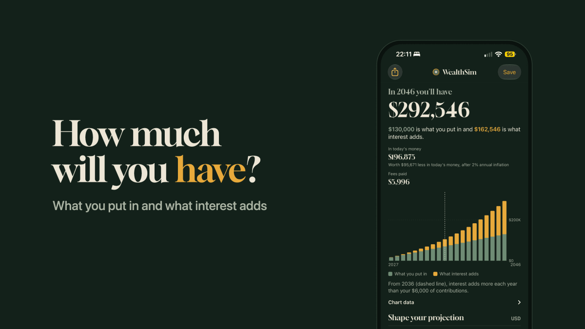
The redesign in 80238e9 added PinnedResultBar. Once the large result scrolls past the top, a compact bar keeps the projected year and balance visible during editing. The chart also changed to bars separating contributions from interest.
The projection engine did not need new maths for this. The interaction needed the answer to stay near the input. A screenshot of the initial viewport could look fine while missing the whole problem; you had to scroll to a control and change it.
This is the review checklist I would reuse, ordered from a specific inconsistency to the larger product bet:
| What the person encounters | What I changed | What I can verify |
|---|---|---|
| A preset and its applied result disagree | Feed the active fee and inflation into the preview | Compare preview and result after applying the preset |
| Exploration can trigger an ad | Exclude presets from the counter and protect first use | Check that the gesture cannot enable an interstitial |
| Editing scrolls the answer away | Keep a compact balance visible | Move a control with the main result offscreen |
| A saved projection offers no task for next month | Add My Plan and balance check-ins | Test the flow; whether anyone returns needs actual usage evidence |
My Plan gives the projection something real to compare with
A calculator can serve someone perfectly well in one visit. Closing it after getting an answer is not a failure. To make another visit worthwhile, I needed a task that would change over time.
My Plan lets you turn a projection into a goal with an amount and date, then enter your actual balance each month and compare it with the plan’s route. The free tier allows one active plan. A monthly reminder is optional, and notification permission is requested when you enable it.
The distinction lives in GoalPlan and PlanCheckIn. A saved projection holds assumptions; a check-in records an observation. PlanStore.logCheckIn updates the month’s entry if one already exists, so correcting October’s balance does not produce a second October on the chart.
There is a simplification behind that route. PlanRoute takes annual values from InvestmentProjector and interpolates between them for monthly comparisons. It is a reference built from the plan’s assumptions, not a prediction of the market’s path. Entering balances is also manual work. A reminder is only useful if the comparison earns that effort.
What I want to find out next is whether someone logs a balance and returns in another month to compare it. A notification open alone would not tell me that the plan helped.
I built more than I can currently validate
The October 5 review recorded that App Store Connect was not providing retention data and that the app lacked product analytics to answer these questions. As of October 6, I cannot report a measured retention improvement from this redesign.
There is another problem with the story I would like to tell: 80238e9 bundled My Plan, the visual redesign and Pro features into one commit. Even if usage later rises, that bundle will not tell me which change caused it. It was substantially more work than fixing the preview and removing the top banner.
If I repeated the process, I would start with those smaller fixes, watch someone unfamiliar with the app use the flow, and treat My Plan as a separate hypothesis. It costs more to build and depends on people wanting that monthly task. The preview mismatch and the early interruption could be fixed without making that bet.
Pick one card in your product that previews an outcome. Record its value, take the action, and compare the result with the user’s settings still applied. A mismatch gives you something concrete to fix before you open the roadmap.
Sources and scope
This account uses my October 5 UI review and WealthSim’s private repository history: 0f507ae for the first-session changes and 80238e9 for the redesign and My Plan. The reproduced test is in FirstSessionUXTests.swift; monthly entries and the reference route are in PlanStore.swift and PlanMath.swift. These are code changes, not results from a retention experiment or confirmation that every feature is available on the App Store.
Related reading: storing these records comes with its own decisions. In my other app, I wrote about how SwiftData and CloudKit shape the model before anything syncs.
P.S. Found a preview that promised something different from what its button did? Tell me the example on Twitter/X.